Sankey Plots 101
Sankey Plots 101
Introduction to Sankey Plots
What is a Sankey Plot?
A Sankey plot (or diagram) is a type of flow diagram that visually represents the flow of resources, energy, or information from one point to another. It is characterized by arrows or paths that vary in width proportionally to the flow rate or quantity they represent. This makes Sankey plots particularly useful for showing how quantities split and combine as they move through a system.
Key Components of a Sankey Plot:
- Nodes: These represent the different stages, categories, or entities through which the flow passes.
- Links: These are the arrows or paths connecting the nodes, representing the flow between them. The width of these links is proportional to the magnitude of the flow.
Purposes of Sankey Plots:
- Visualizing energy flows and losses within a system.
- Tracking financial transfers and budgets.
- Understanding material flows in production processes.
- Displaying user journey through a website or application.
- Any scenario where it's crucial to show the distribution and flow of quantities.
Data Structure for Sankey Plots:
The data for a Sankey plot typically involves two main parts: nodes and links.
- Nodes: An array of objects representing the different stages or entities in the flow.
- Links: An array of objects representing the connections (flows) between the nodes, including the source node, target node, and the value (quantity) of the flow.
Creating a Sankey Plot Using Plotly
Step-by-Step Guide:
-
Install Plotly: If you don't already have Plotly installed, you can install it using pip:
pip install plotly -
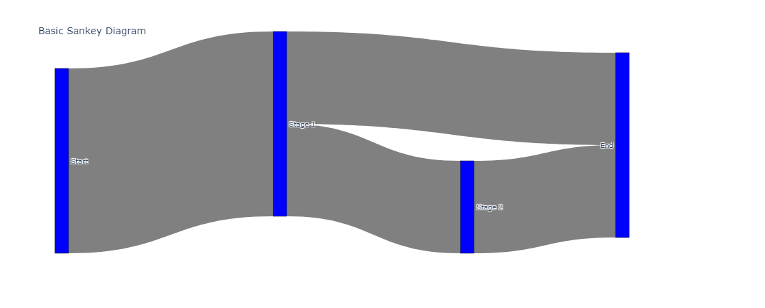
Prepare Your Data: Example data for a Sankey plot might look like this:
nodes = [ {"name": "Start"}, {"name": "Stage 1"}, {"name": "Stage 2"}, {"name": "End"} ] links = [ {"source": 0, "target": 1, "value": 10}, {"source": 1, "target": 2, "value": 5}, {"source": 1, "target": 3, "value": 5}, {"source": 2, "target": 3, "value": 5} ] -
Create the Plot: Here's how to create a Sankey plot using Plotly in Python:
import plotly.graph_objects as go

# Define the nodes and links
nodes = ["Start", "Stage 1", "Stage 2", "End"]
link_data = [
    {"source": 0, "target": 1, "value": 10},
    {"source": 1, "target": 2, "value": 5},
    {"source": 1, "target": 3, "value": 5},
    {"source": 2, "target": 3, "value": 5}
]

# Prepare the data for the Sankey plot
sankey_data = go.Sankey(
    node=dict(
        pad=15,
        thickness=20,
        line=dict(color="black", width=0.5),
        label=nodes,
        color="blue"
    ),
    link=dict(
        source=[link["source"] for link in link_data],
        target=[link["target"] for link in link_data],
        value=[link["value"] for link in link_data],
        color="gray"
    )
)

# Create the figure
fig = go.Figure(sankey_data)
fig.update_layout(title_text="Basic Sankey Diagram", font_size=10)
fig.show()
Interpretation and Inference:
When analyzing a Sankey plot, you can infer:
- Flow Distribution: Which paths or processes are receiving the most resources.
- Bottlenecks: Where the flows might be narrowing, indicating potential bottlenecks or inefficiencies.
- Balance: Whether the input and output flows are balanced, helping to identify any losses or discrepancies.
- Proportions: The relative proportions of different branches, which can be crucial for decision-making and optimization.
Practical Example:
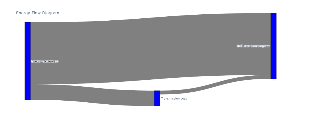
Suppose you want to analyze the flow of energy through a system with stages like generation, transmission, and consumption. Your data might look like this:
nodes = ["Energy Generation", "Transmission Loss", "End User Consumption"]
links = [
    {"source": 0, "target": 1, "value": 200},
    {"source": 0, "target": 2, "value": 800},
    {"source": 1, "target": 2, "value": 50}
]
Creating the Plot for the Example:
import plotly.graph_objects as go

nodes = ["Energy Generation", "Transmission Loss", "End User Consumption"]
link_data = [
    {"source": 0, "target": 1, "value": 200},
    {"source": 0, "target": 2, "value": 800},
    {"source": 1, "target": 2, "value": 50}
]

sankey_data = go.Sankey(
    node=dict(
        pad=15,
        thickness=20,
        line=dict(color="black", width=0.5),
        label=nodes,
        color="blue"
    ),
    link=dict(
        source=[link["source"] for link in link_data],
        target=[link["target"] for link in link_data],
        value=[link["value"] for link in link_data],
        color="gray"
    )
)

fig = go.Figure(sankey_data)
fig.update_layout(title_text="Energy Flow Diagram", font_size=10)
fig.show()
Advanced Understanding and Use of Sankey Plots
Now that you have a foundational understanding of Sankey plots, let's delve deeper into more advanced aspects, including customization, handling complex datasets, and interpreting real-world scenarios.
Advanced Customization with Plotly
Adding Colors and Labels: Customizing colors and adding detailed labels can make your Sankey plot more informative and visually appealing. You can specify colors for both nodes and links and add labels for better clarity.
Example:
import plotly.graph_objects as go

# Define nodes and links {#define-nodes-and-links}
nodes = ["Start", "Stage 1", "Stage 2", "Stage 3", "End"]
link_data = [
    {"source": 0, "target": 1, "value": 10},
    {"source": 1, "target": 2, "value": 5},
    {"source": 1, "target": 3, "value": 5},
    {"source": 2, "target": 4, "value": 5},
    {"source": 3, "target": 4, "value": 5}
]

# Define colors for nodes and links {#define-colors-for-nodes-and-links}
node_colors = ["blue", "orange", "green", "purple", "red"]
link_colors = ["blue", "orange", "green", "purple", "red"]

# Create the Sankey plot {#create-the-sankey-plot}
sankey_data = go.Sankey(
    node=dict(
        pad=15,
        thickness=20,
        line=dict(color="black", width=0.5),
        label=nodes,
        color=node_colors
    ),
    link=dict(
        source=[link["source"] for link in link_data],
        target=[link["target"] for link in link_data],
        value=[link["value"] for link in link_data],
        color=link_colors
    )
)

# Create the figure {#create-the-figure}
fig = go.Figure(sankey_data)
fig.update_layout(title_text="Customized Sankey Diagram", font_size=10)
fig.show()
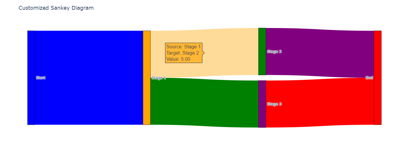
Hover Information: Adding hover information can enhance the user experience by providing more details when the user hovers over a node or link.
sankey_data = go.Sankey(
    node=dict(
        pad=15,
        thickness=20,
        line=dict(color="black", width=0.5),
        label=nodes,
        color=node_colors,
        hovertemplate='Node: %{label}<extra></extra>'
    ),
    link=dict(
        source=[link["source"] for link in link_data],
        target=[link["target"] for link in link_data],
        value=[link["value"] for link in link_data],
        color=link_colors,
        hovertemplate='Source: %{source.label}<br>Target: %{target.label}<br>Value: %{value}<extra></extra>'
    )
)
Handling Complex Datasets
In real-world scenarios, datasets can be more complex with multiple stages and large volumes of data. Here's how you can manage and visualize such datasets effectively:
-
Data Preparation:
- Clean and preprocess the data to ensure there are no inconsistencies.
- Aggregate data if necessary to reduce complexity.
-
Dynamic Plotting:
- Use loops and conditional statements to dynamically generate nodes and links from the dataset.
Example:
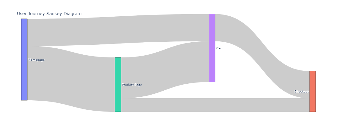
Suppose you have a dataset representing user journeys through a website.
import pandas as pd

# Example dataset {#example-dataset}
data = {
    "source": ["Homepage", "Homepage", "Product Page", "Product Page", "Cart"],
    "target": ["Product Page", "Cart", "Cart", "Checkout", "Checkout"],
    "value": [100, 50, 75, 25, 50]
}
df = pd.DataFrame(data)

# Extract unique nodes {#extract-unique-nodes}
nodes = list(set(df["source"]).union(set(df["target"])))
node_indices = {node: i for i, node in enumerate(nodes)}

# Create the Sankey plot {#create-the-sankey-plot}
sankey_data = go.Sankey(
    node=dict(
        pad=15,
        thickness=20,
        line=dict(color="black", width=0.5),
        label=nodes
    ),
    link=dict(
        source=[node_indices[src] for src in df["source"]],
        target=[node_indices[tgt] for tgt in df["target"]],
        value=df["value"]
    )
)

# Create the figure {#create-the-figure}
fig = go.Figure(sankey_data)
fig.update_layout(title_text="User Journey Sankey Diagram", font_size=10)
fig.show()
Interpreting Complex Sankey Plots
In complex scenarios, Sankey plots can reveal important insights such as:
-
Major Flows: Identifying the primary paths and where most of the resources or users are moving.
-
Drop-off Points: Detecting significant drop-off points where there is a reduction in flow, indicating potential areas of loss or inefficiency.
-
Bottlenecks: Recognizing bottlenecks where the flow is constricted, helping to identify areas that may need optimization.
-
Proportional Analysis: Understanding the relative proportions of different branches, which can be critical for balancing resources or optimizing processes.
Practical Use Cases
-
Energy Management: Visualizing the flow of energy from generation to consumption, including losses in transmission.
-
Financial Flows: Tracking financial transactions between different departments or projects within an organization.
-
Supply Chain Management: Understanding the flow of materials and products through the supply chain, from suppliers to end consumers.
-
Customer Journeys: Analyzing how customers navigate through a website or service, helping to optimize user experience and increase conversions.
Conclusion
Sankey plots are powerful visualization tools for tracking flows and distributions within complex systems. They help identify key points in the flow, such as bottlenecks, imbalances, and proportional distributions, making them valuable for a variety of applications from energy management to financial analysis. By leveraging libraries like Plotly, you can create insightful and interactive Sankey diagrams to support your data analysis needs.